
Project Overview
In my role as a Senior UX/UI Designer, I had the opportunity to work on this ambitious project aimed at creating a decentralised mobile solution for managing personal data.
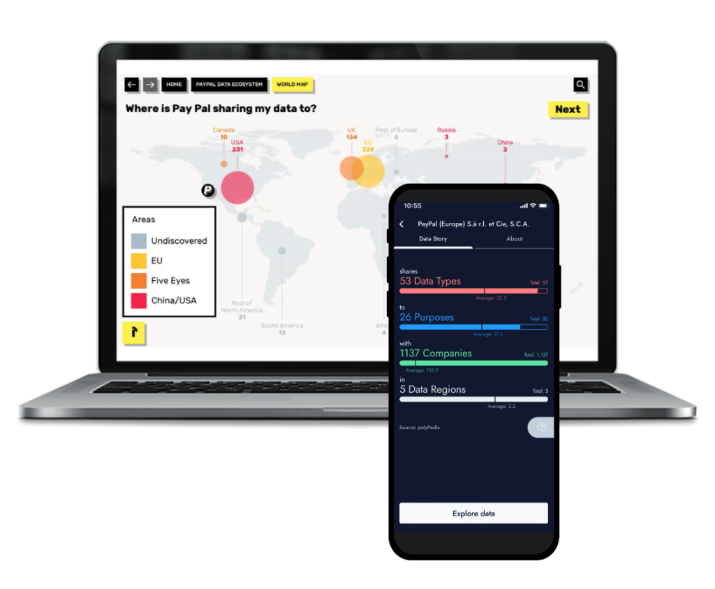
Our goal was to develop a user-friendly and visually appealing mobile app that could handle large amounts of personal data, such as social media activity, while ensuring it was understandable for users of all types.
Embracing best practices and Collaboration
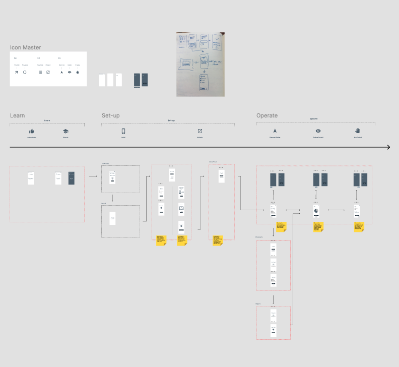
During the design process, I played a key role in defining and producing the minimum viable product (MVP) version. Collaboration was essential, and I worked closely with the development team and an external designer to ensure the feasibility of our vision. We aimed to strike a balance between industry best practices and custom solutions tailored to address specific challenges, such as finding the optimal approach for listing and filtering versus graphical navigation.
To bring our ideas to life, I engaged in prototyping and created a clickable version of the app for testing purposes. This allowed us to iterate on the design and gather valuable feedback. We also established clear documentation and feedback repositories to ensure a smooth communication flow throughout the design process.
Challenges and Iterations: Navigating Information Overload
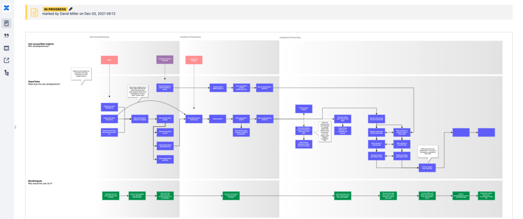
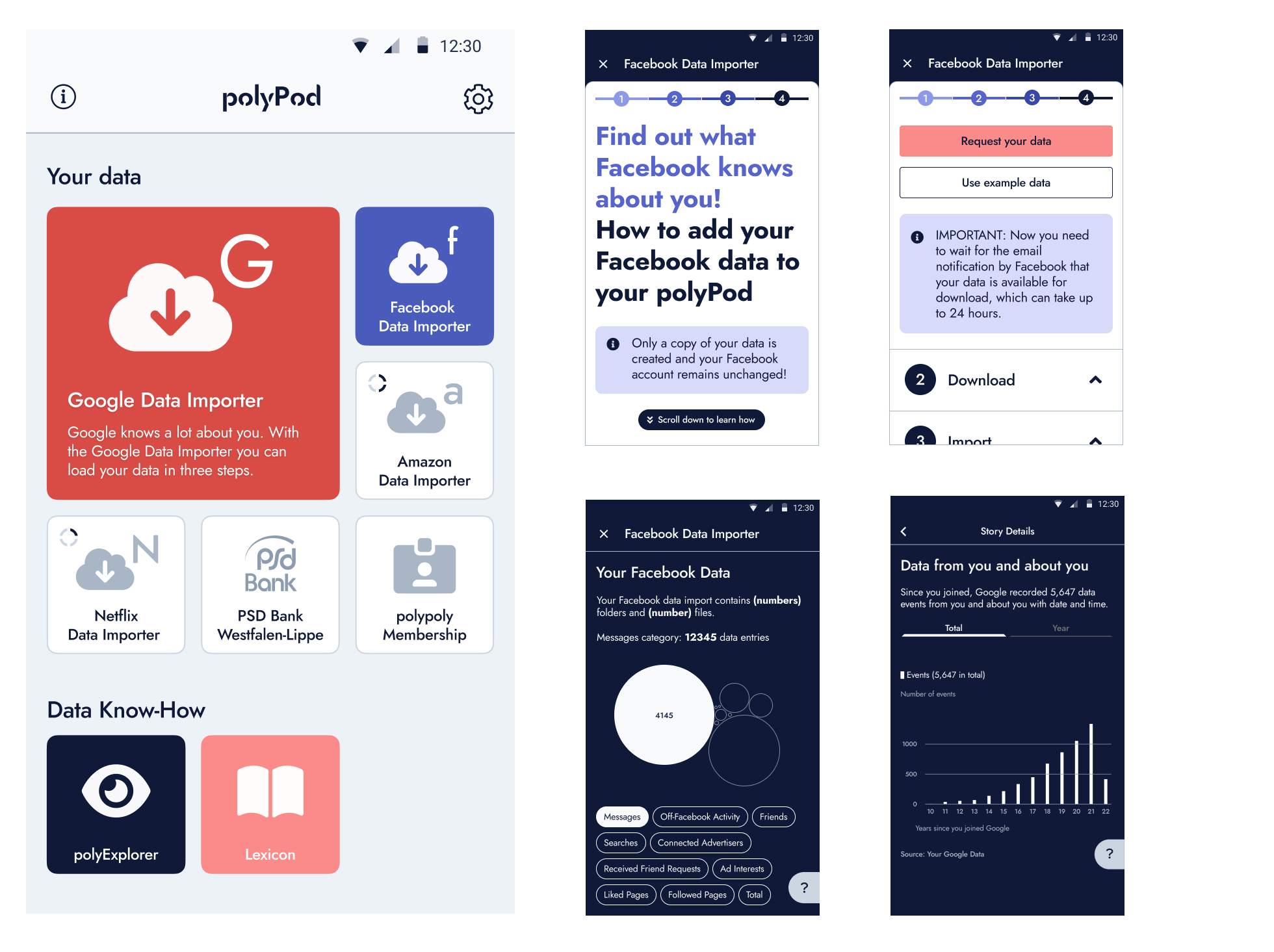
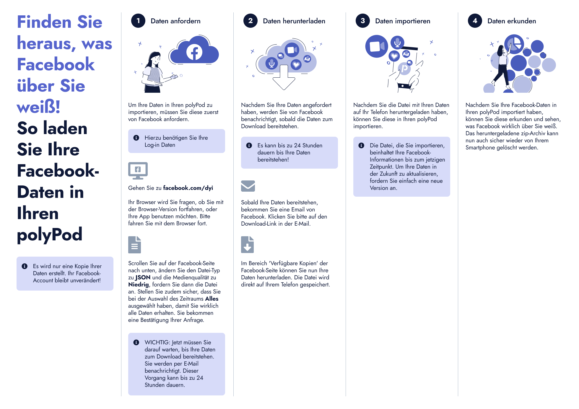
One of the main challenges we encountered was handling the vast amount of information that needed to be presented to the user. We recognised the need for a clear and intuitive user experience, even with content-heavy screens. Progressive disclosure became a focal point, ensuring that information was revealed to users at the right moment and when they needed it the most.
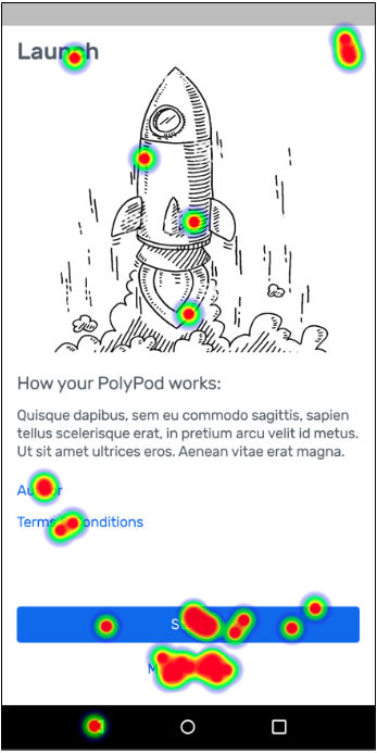
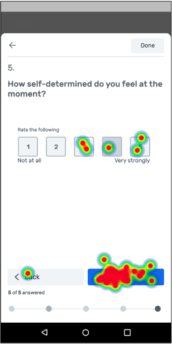
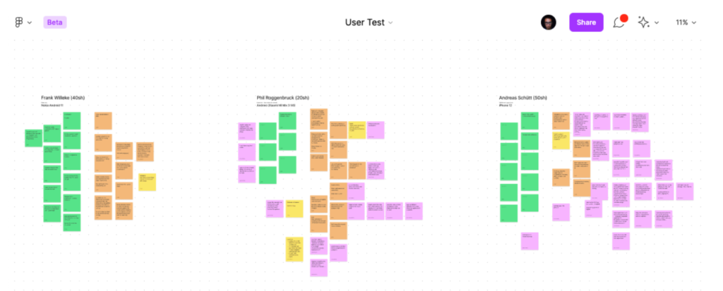
Through user research and testing phases, we discovered unexpected user behaviours and desires for extended functionality. We conducted both internal tests with our colleagues and external remote, unmoderated interviews with screen recording. This allowed us to explore new ground and gain insights into the users’ perspectives.
Design Enhancements and User Feedback
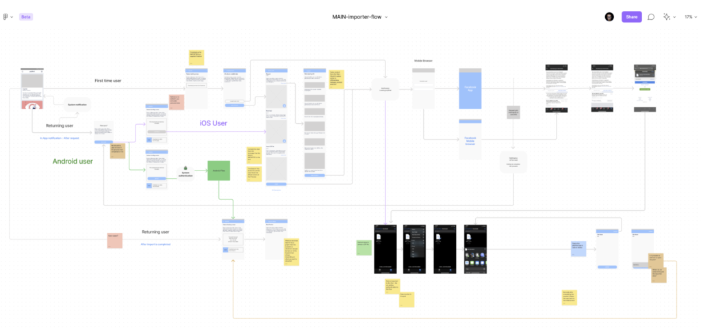
User feedback played a crucial role in shaping the design iterations. One notable change we made was to clarify the distinction between real content and sample content. Testers were sometimes unsure whether the content was active or could be personalised.
As a solution, we introduced visual indicators to differentiate “deactivated” content, giving users the confidence to activate and import their own data from platforms like Facebook.
Metrics and Lessons Learned
As we didn’t have analytics in the mobile app at that stage, we relied heavily on qualitative feedback gathered through testing sessions. This feedback helped inform design decisions, ensuring that the user experience aligned with user expectations and needs.
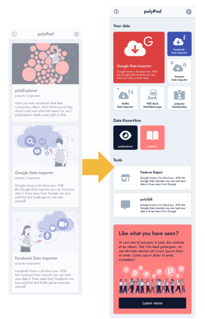
A significant lesson learned from this project was the need for flexibility and adaptability. Since the app relied on user-imported personal data, we faced the challenge of designing layouts without complete knowledge of the specific content structure. To address this, we revised the initial home page design, creating a scalable solution that could accommodate additional features and varying hierarchies.
Collaboration and Building a Design System
Successful collaboration with team members from different disciplines greatly contributed to the project’s success. Given the complexity of the solution, it was crucial to establish a strong relationship with the tech lead and senior developers.
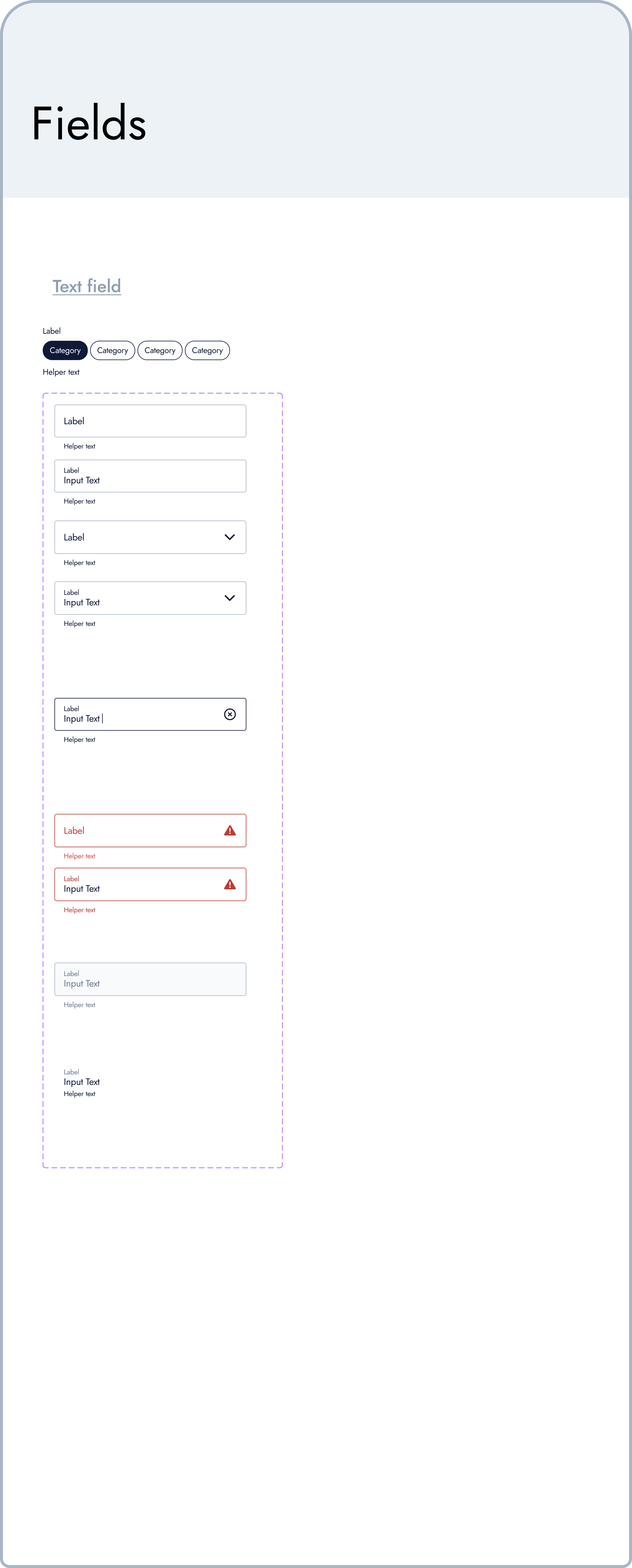
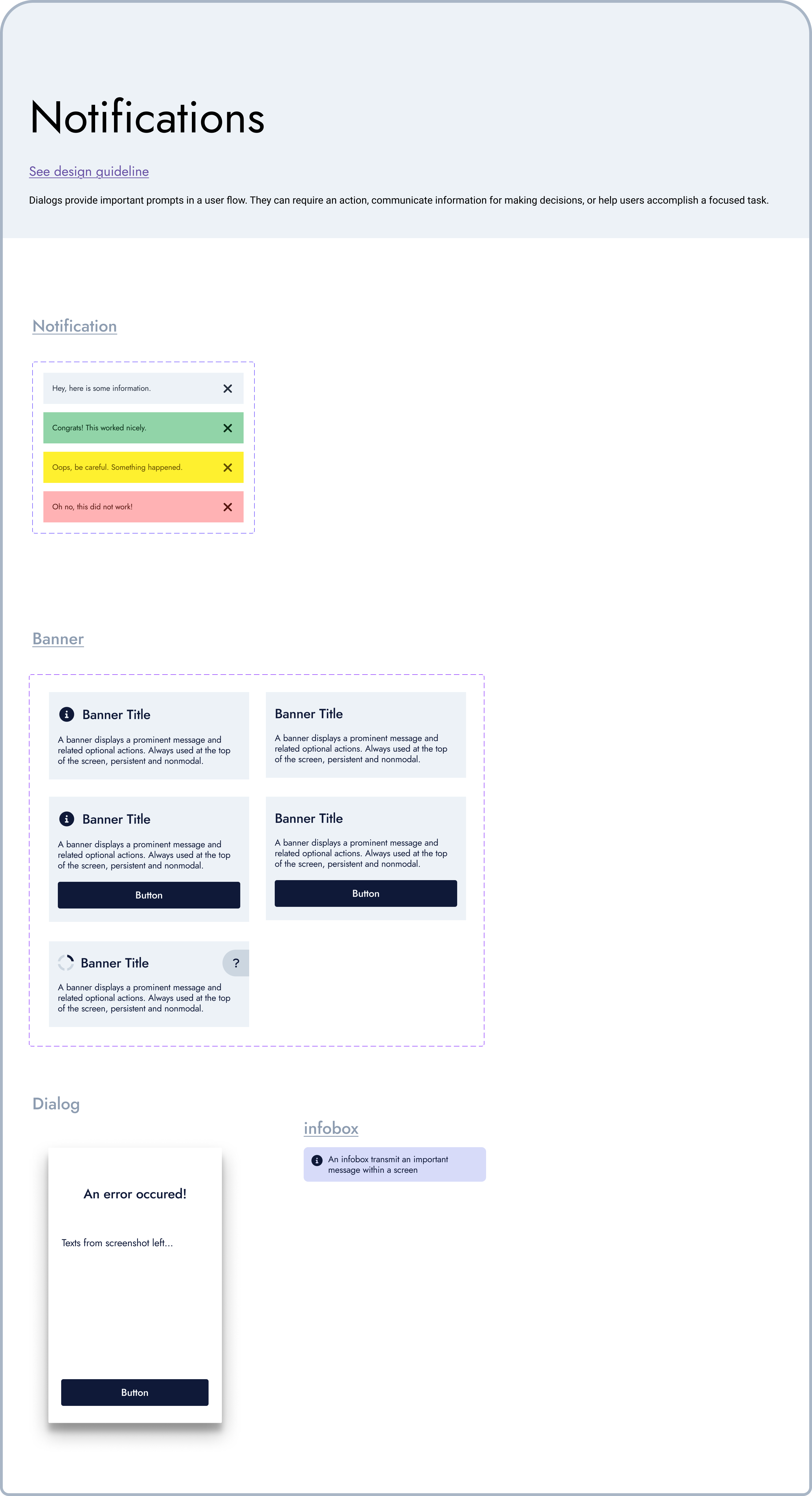
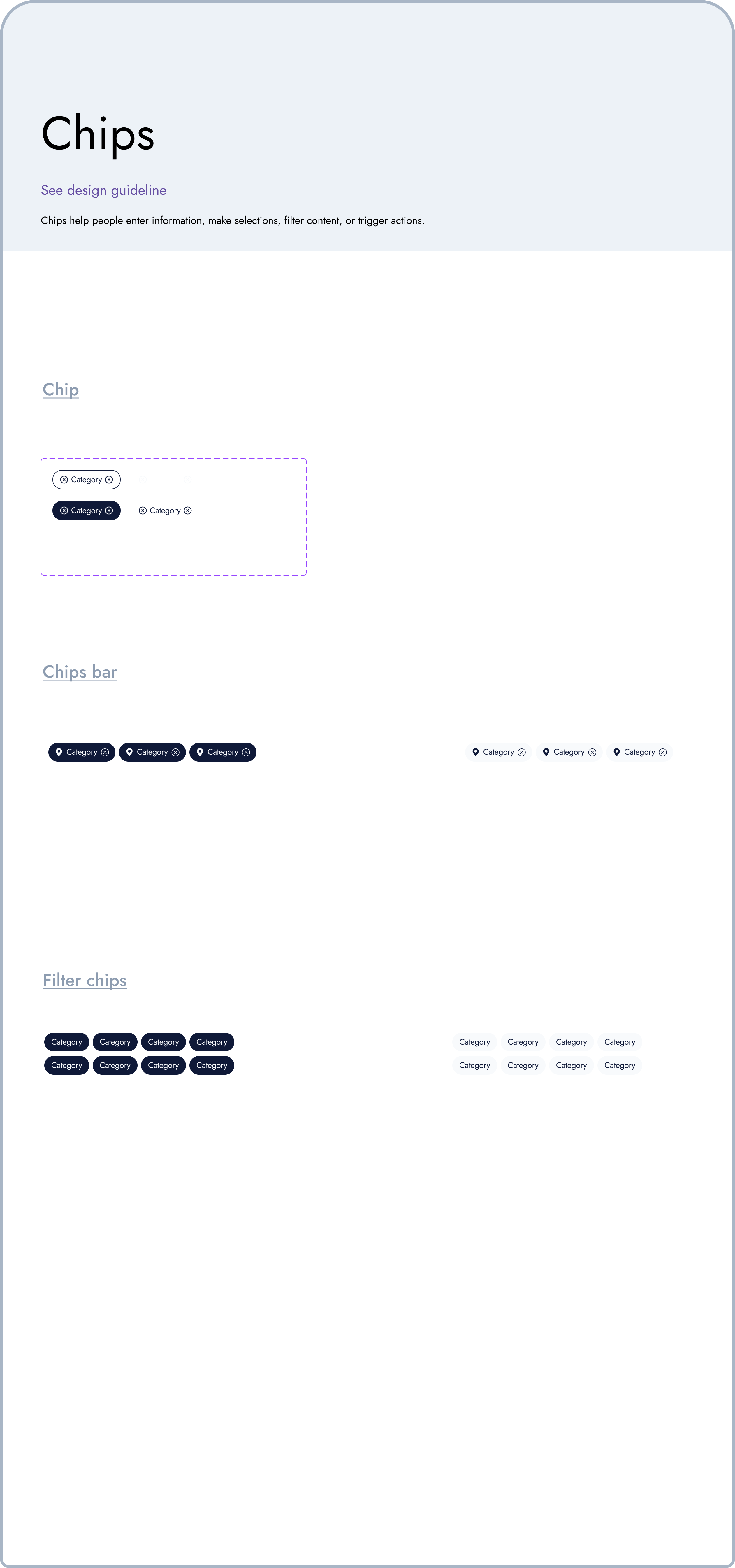
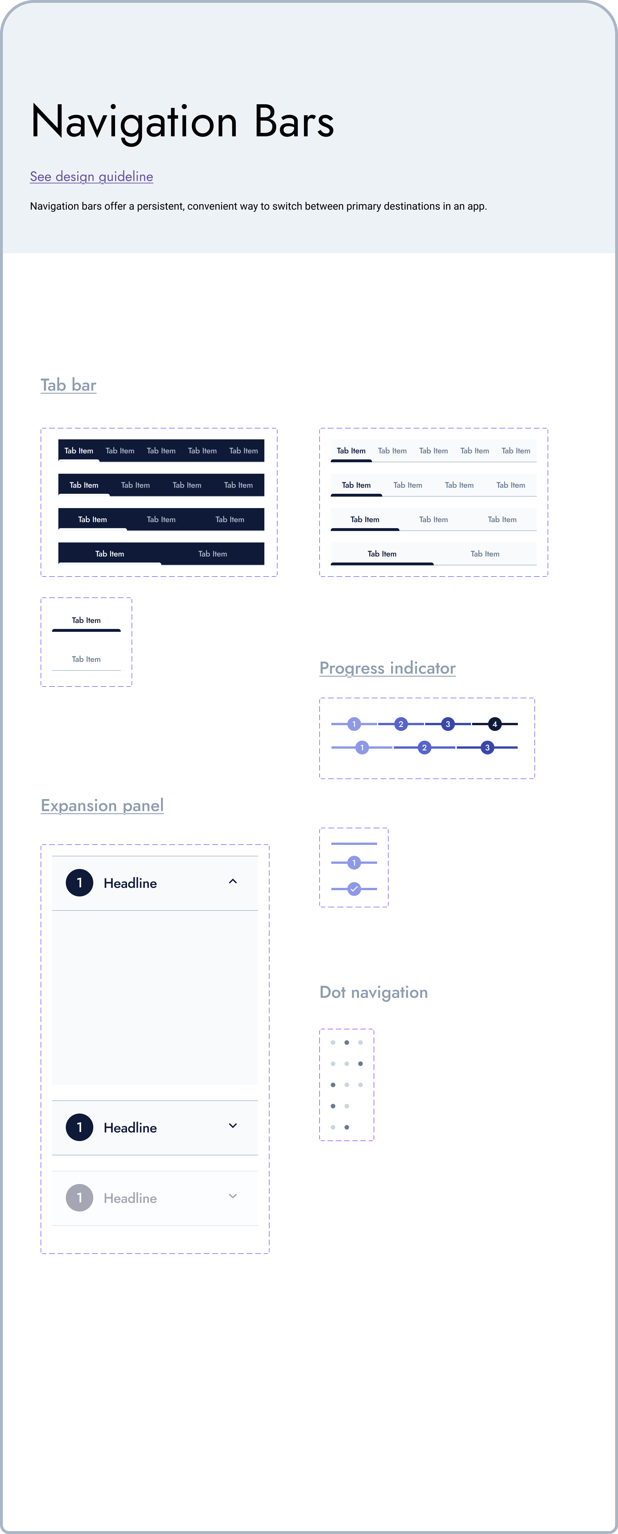
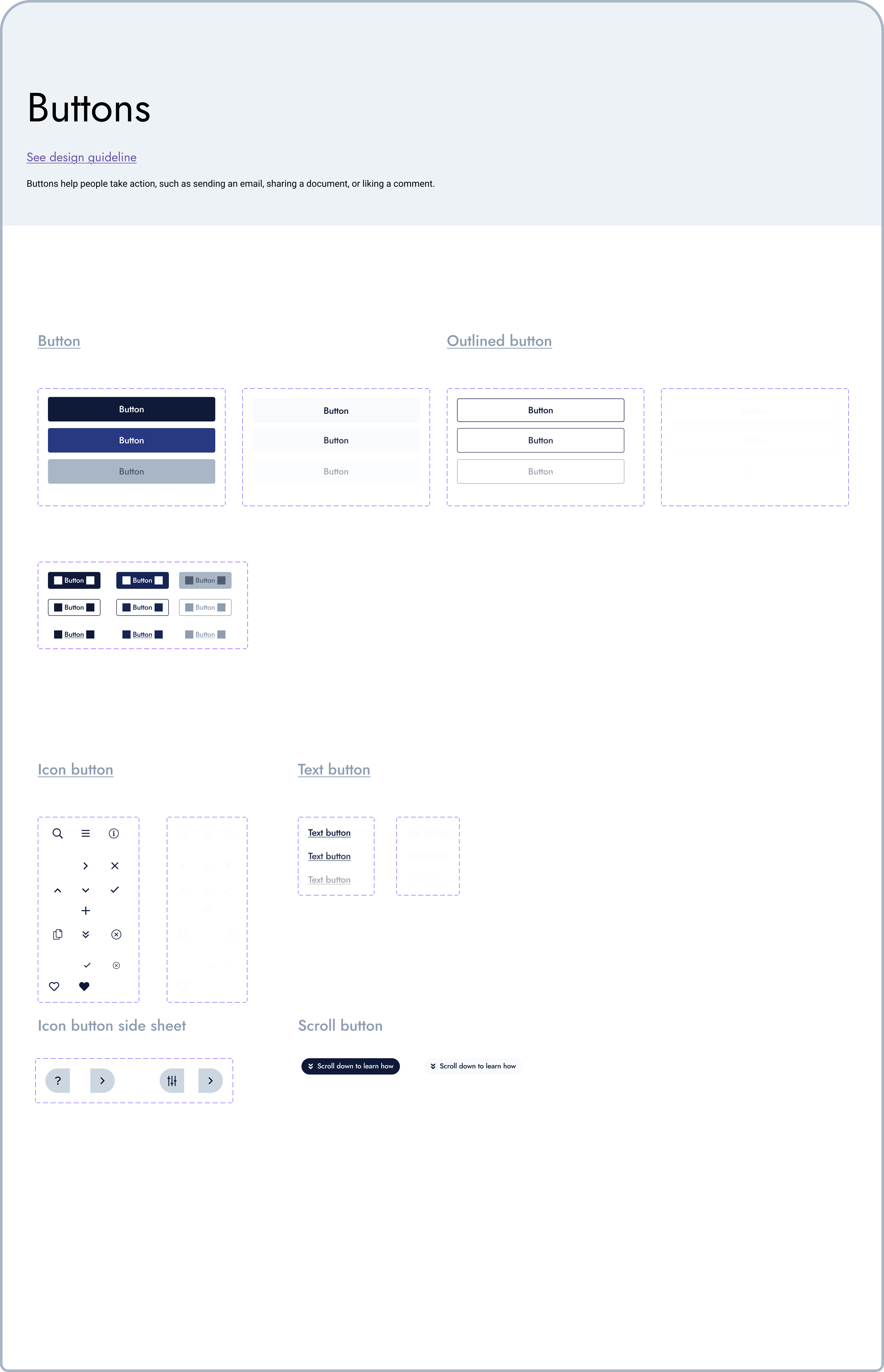
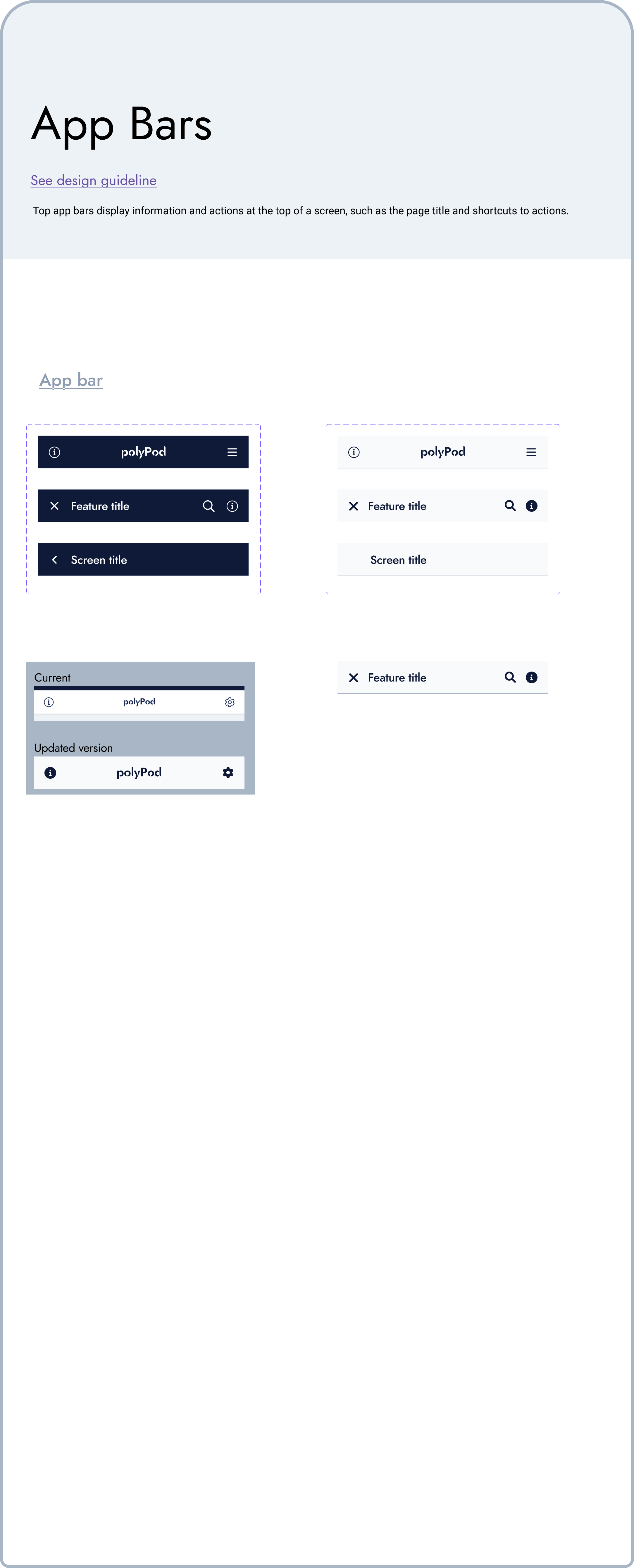
Together, we focused on bridging the gap between design and implementation, paving the way for the creation of a robust design system. This involved information architecture, mapping navigation patterns, defining component semantics, and implementing tools like Storybook for efficient collaboration.
Personal Reflections: Balancing Best Practices and Novelty
Throughout the project, I grappled with the challenge of balancing best practices in navigation and user behaviour with the learning and discovery phase inherent in a product that introduced something entirely new. This was particularly evident as we integrated user-imported data from external sources like Google or Facebook profiles. It required careful consideration to strike the right balance between established design principles and the unique characteristics of our product.
In conclusion
The described design case study demonstrates a human-centred design approach, leveraging user research, collaboration, and iterative testing to create a user-friendly mobile app for managing personal data. We prioritised usability, information disclosure, and the ability to handle diverse data inputs, incorporating user feedback to enhance the design. The project also emphasised the importance of adaptability and collaboration in bridging the gap between design and implementation.